[February 2024] I wrote this paper in graduate school for a History of the Book class I took in the School of Printing Carey Library with Professor David Pankow at RIT. As I am digging into design history, I thought it would be fun to drag these papers out of the floppy disk where they lived and give them some evergreen life on the internet. Published on Medium August 2023.
[Originally written Winter 1993]
It is the spirit of the letterforms that is important, and just as the human spirit is elusive and indefinable, so is the spirit of carved, written, and printed words.[1]
The end of the 14th and the beginning of the 15th centuries ushered in a new way of thinking for the intellectuals in Italy. What started as a literary movement inspired by Petrarch exploded into the Age of Humanism as scholars, scribes, artists and architects rediscovered the words and philosophies of ancient Greece and Rome.
The development of classical studies saw an over-arching preoccupation with geometry and the laws of mathematics. It was believed that mathematics mirrored the exact rhythm according to which God created the universe.[2] This rediscovery of a way of thinking centered around the writings of Marcus Vitruvius, the 1st century BC Roman architect. Vitruvius’ work introduced concepts about the proportions of the human figure as related to the most perfect geometrical figures, the circle and the square. This simple picture seemed to reveal a deep and fundamental truth about man and the world. [3] This concept was of great importance to the intellectuals of Italy and affected the way they approached architecture, art, music, literary work and classical studies.
The study of the classics included the study of historical inscription abundant on buildings and monuments throughout the cities and countryside of Italy. By the second half of the 14th century, inscriptions were considered of value as historical, literary and linguistic documents which yielded important information about the ancient times as well as useful formulas and phrases. [4] As the fifteenth century progressed, collections of these inscriptions (called sylloges) were collected by scholars and many saw an increasing interest not only in the inscriptions for their content but also for the forms of the letters themselves.
The scholarly study of inscriptions and their letterforms can be traced to a group of antiquarians, scholars and artists, centered around the cities of Verona and Padua. These were Ciriaco of Ancona; his pupil Felice Feliciano of Verona; Giovanni Marcanova of Padua; Fra Giovanni Giocundo of Verona; Bartolomeo Sanvito of Padua and Felice’s good friend Andrea Mantegna also of Padua.[5] The study of inscriptions is also evident in the work of architect Leon Battista Alberti.[6] Through their works (paintings, murals, sculpture, architecture, illuminations and calligraphy) these scholars spread their concept of the ideal letter as embodied in Roman capitals.

As the study and popularity of sylloges increased so did the preoccupation with the relationship of the letterform to geometry. This increasing popularity led to the advent of the writing master’s books. These books, essentially pattern books, showed how, through illustrations and written explanations, the Imperial Roman capitals were created using geometry as the basis for their construction.
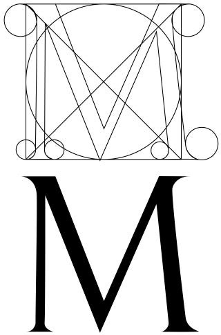
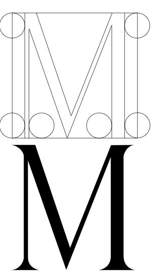
The earliest of these was by the scribe and scholar Felice Feliciano. His treatise, written in 1463, is known only in manuscript form. Feliciano constructs the Roman letters under the basic assumption that ‘it was the ancient usage to form the letter from a circle and a square.’[7] By this assumption his own letters are constructed with the compass and a ruler according to the measurements he had made after studying the letters on monuments in Rome and elsewhere. His results are an idealized and broadly proportioned alphabet. It was also a practical one in that the central line of the V-cut (for use by stone masons) was drawn into each of his letters.[8]
Study of Feliciano’s manuscript, according to Millard Meiss, proves he not only advocated geometric construction but applied his principles to his own drawings. Faint traces of circles, squares and diagonals, as well as the central prick of the foot of the compass may be seen on many of the folios. The geometric forms were drawn in the brownish ink used afterwards to outline the letters and they were erased after the shapes of the letters had been determined.[9] Although he advocated the use of geometry, some of his letters, the H in particular, do not come near to filling the square format.
Feliciano’s treatise instructed and standardized the measurements of the strokes as well as the relationships of width to height. In general his proportions were 1:10, which was in keeping with the architectural canon of Vitruvius.[10] His treatise presented a geometrically fixed way of handling the Roman capitals and served as a model for stone cutters as well as influencing the work of Alberti and Fra Luca Pacioli.
Feliciano’s close friend Andrea Mantegna often accompanied him on outings to study inscriptions and was the subject of a dedication of inscriptions compiled by Feliciano. In the dedication, Feliciano praises Mantegna’s knowledge of antiquity. Although Mantegna never wrote a formal treatise on letterform construction, his interest and study of their forms and proper proportions are evident in his frescoes at the Eremitani Chapel at Padua as well as within many of his paintings.[11]
What is thought to be the earliest printed book on the construction of letterforms is credited to Damiano de Moyllus. The volume was discovered by Mr. Olschki in and is without title or date. Through the study of other books Moyllus printed, this treatise seems to have been printed between 1477 and 1483, a few years after Feliciano’s manuscript.[12] Moyllus continues the standard of constructing the letters within a square and a circle, and although he advocates the proportion of 1:12, his patterns look like a typographic adaptation of Feliciano’s work.[13]

Until the recent discovery of the treatise by Moyllus, the work of Fra Luca Pacioli was considered to be the first printed volume containing constructed Roman letters. Pacioli’s treatise, De Divina Proportione, was a study on plane and solid geometry and included a section about the construction of letterforms. Although it was completed in December of 1497 and printed in Florence in 1509, the section of it that deals with inscriptions and letters was composed more than twenty years earlier.[14] The artist Leonardo da Vinci, a friend of Pacioli’s is credited with the drawing of the illustrations within the treatise, including those of the letters. In the text Pacioli proceeds to tell his readers that it was “the most excellent painter in perspective, architect, musician and man de tutte virtu doctato, Leonardo da Vinci, who deduced and elaborated a series of diagrams of regular solids at the time of his sojourn at Milan.”[15]
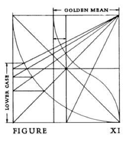
In Pacioli’s work we find direct references to Vitruvius’ concepts. “First we shall talk of the proportion of man, because from the human body derive all measure and their denominations and in it is to be found all and every ratio and proportion by which God reveals the innermost secrets of nature…for in the human body they [the ancients] found the two main figures without which it is impossible to achieve anything, namely the perfect circle and the square.”[16] The letters by da Vinci are constructed, one to a page, using the circle and square and a proportion of 1:9. His capitals illustrate the use of the Golden Mean proportion in order to find beauty and perfect harmony. This proportion was the guiding principle of order and reveals the harmony between all the parts and the parts to the whole.[17] Pacioli’s treatise established the norm for the design of Roman capitals (except for variations in stroke width to height) that endured through the 16th century.

As the Renaissance progressed, visitors and scholars from other countries became increasingly influenced by the practices of Italy’s scholars and artists. In 1525, after visiting Italy, Albrecht Dürer published his treatise on the construction of Roman capitals. Dürer, being a successful artist was free from the trappings surrounding the strict use of geometric theories. His constructions work with the ratio of 1:10 and are related to the square. Unlike his predecessors however, Dürer does not distort his letters in order to make them fit the system. In his notes Dürer emphasizes that there are certain faults in the construction which can only be properly adjusted by the trained hand and eye — curves for instance, that need more fullness, flattening or other adjustments.[18]
Another visitor and scholar was the Frenchman Geofroy Tory. Tory had been greatly impressed by the work of Italian artists and scholars and after his return from a second visit in 1516, he became an enthusiastic promoter of Renaissance culture. Tory translated classic works into French and was an advocate of the use of French as a literary language. Up to this point Latin was the primary scholarly language.
In 1524 he began a monumental treatise, the Champ fleury, that contained his theories on letterform construction. It was completed and printed in 1529. This was the first time that a study of Roman alphabet forms was attempted in French.[19] Tory was familiar with the work of Dürer, Pacioli and the other Italian writing masters and derives many of his theories from them. He believed that all the letters were derived from the I and the O and could be developed on the basis of the perfect human proportions. In this thinking he accepts the concepts of Vitruvius and works with a ratio of 1:10.
Tory spends a great deal of time explaining how to construct each letter and presents each letter within a 10×10 grid. This is the first time in letterform construction that a grid is used for plotting the form.[20] In addition he gives detailed descriptions on the correct pronunciation for each letter and its grammatical usage, as well as lengthy allegories and religious philosophy associated with the origins of the letter.
In another section Tory discusses the works of Pacioli, Dürer and others. He mainly criticizes them on their lack of instructions concerning the construction of their letters. He accuses Pacioli of stealing his letters from da Vinci then proceeds to say that they probably are his own because the proportions are so poorly drawn. He subjects Dürer to a letter by letter critique and then forgives him on the basis that he is a painter and painters are not good “grammarians in the matter of understanding the qualities and proportions of well-formed letters.”[21]
The Champ fleury and Tory’s promotion of the Roman letter forms had much to do with the change French founts underwent between 1530 and 1540 by such typographers as Garamond and Granjon.[22]
The great era of constructed letters following the theories of Vitruvius came to an end with the work of the scholar Cresci and his followers. Cresci advocated that while a complete knowledge of the ancient capitals was the basis of good writing, the ‘false rules’ practiced by his contemporaries can be more lenient. He believed in using a proportion of 1:8 or 1:7 1/2, 1:9 or even 1:10 depending on the size of the letters, the height at which they were to be placed and the space available.[23]
Cresci’s concepts culminate in the work of his pupil and successor Luca Horfei of Fano. With Horfei’s alphabet , like Dürer’s, we find geometry used as a means to an end and the use of the eye being the criterion for the final judgment.
The golden age of humanism sparked the curiosity and exploration of many artists and scholars across Europe. The concentration with which many studied and created the Roman capital forms established the norm for letterform design that is evident even today. The strict adherence to the rules of geometry produced letters that were sterile in their beauty and lacked vitality. Thankfully the artists and letterers whose work evolved from the basic traditions (Dürer, Cresci and Horfei) realized that a combination of the geometry and the eye (as well as the mind of the artist) could be used to create truly beautiful letters that breathed a life of their own.
Geometry can produce legible letters, but art alone makes them beautiful. Art begins where geometry ends.[24]
[1] Monotype Type Index 92.3, (England : Monotype Typography Ltd., 1992), title page.
[2] Eugenio Garin, Italian Humanism — Philosophy & Civic Life in the Renaissance, trans. Peter Munz, (new York : Harper & Row, 1965), 186.
[3] Rudolf Wittkower, Architectural Principles in the Age of Humanism, (New York : Random House, 1962), 14.
[4] Roberto Weiss, The Renaissance Discovery of Classical Antiquity, (New York : Humanities Press, 1969), 145.
[5] James Wardrop, The Script of Humanism, (London: Oxford University Press, 1963), 13.
[6] Weiss, 162.
[7] James Mosley, “Trajan Revived,” Alphabet 1, (1964) , 18.
[8] Ibid, 18.
[9] Millard Meiss, “Towards A More Comprehensive Renaissance Paleography” The Art Bulletin, XLII, no.2 (June 1960) , 109.
[10] Juliet Spohn Twomy, “Whence Jenson: A Search for the Origins of Roman Type,” Fine Print, 15, no.13 (July 1989), 139.
[11] Meiss, 109.
[12] Damianus Moyllus, Anewly Discovered Treatise on Classic Letter Design, with an introduction by Stanley Morison, (Paris: At the Sign of the Pegasus, 1927), 15.
[13] Weiss, 162.
[14] Moyllus, 17.
[15] Stanley Morison, Fra Luca Pacioli of Borgos, (New York: The Grolier Club, 1933), 9.
[16] Wittkower, 15.
[17] Ibid., 19.
[18] Alexander Nesbitt, The History and Technique of Lettering, (New York : Prentice — Hall, Inc., 1957), 84.
[19] L’Hari Copeland, Design of the Roman Letter, (New York: Philosophical Library, Inc., 1966), 40.
[20] Harry Carter, A View of Early Typography up to about 1600, (Oxford: At the Clarendon Press, 1969), 11.
[21] Geofroy Tory, Champ fleury trans. by George B. Ives, (New York: The Grolier Club, 1927), 35.
[22] Romance of the Printing Type, (CIty of Birmingham School of Printing, College of Arts and Crafts, 1950), 40.
[23] Mosley, 22.
[24] Monotype Type Index 92.3, title page.