One of the projects I started at ADL and never finished, due to it not being core to the mission of ADL, was the visualization and modeling of systemic racism and technology that continues to support systemic racism.
I spent a lot of time reading articles across different fields—healthcare, finance, education, law enforcement etc— and as I read them, I made notes about the kinds of systemic and structural racism that was built in and the outcomes that have been seen through the generations of these practices. I then looked at the kinds of software that exists and is being designed, that continues to perpetuate structural racism. From loan software that biases against people of color, to redlining real estate areas of towns and cities that continues to be supported by online tools, to algorithms and artificial intelligence tools used by law enforcement and judges that are inherently biased against brown people.
I then took all this information and tried to create diagrams that exposed the breadth of the software and the kinds of outcomes of perpetuating racism across these fields. These models were never fully completed and there isn’t an action item or outcome from this because the project stopped. But I feel it’s important to share and maybe someone will find use out of these. My bibliography is a pile of articles, research papers and other materials in a folder. I am happy to share if you are interested.
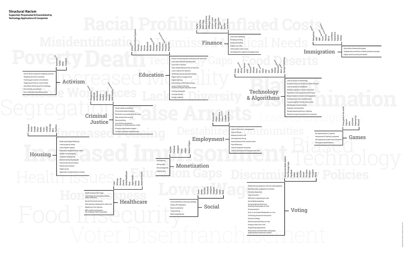
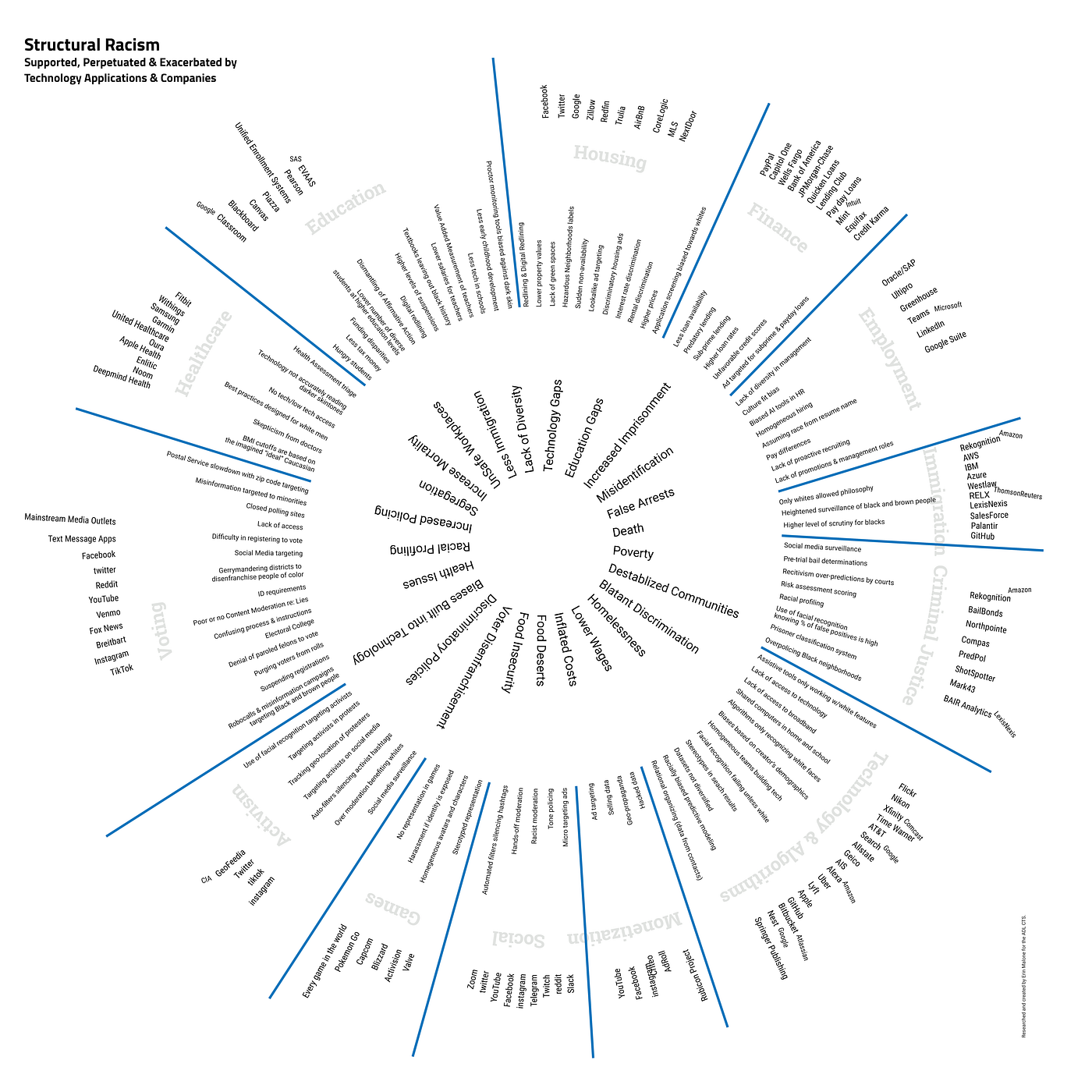
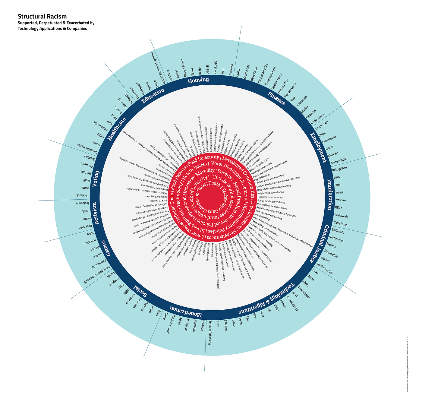
Ultimately, I don’t think any of these diagrams get to what I was trying to visualize but I believe that with a few more iterations it might come close. I also believe that the completion of this work shouldn’t be done alone by me, a white woman, as I am not from the community that is affected by these practices and can only extract these outcomes and understandings as an outsider.
I do believe though that diagrams like these can help teach people with white privilege about the scope and scale of the issues in a quick, visual way that really brings home the largess of the problems to be dismantled and rebuilt.
Originally published on Medium, April 2022