design::writings
Motown
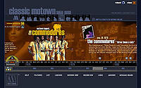 A visual timeline of Motown is a nice combination of imagery, blurbs and points across time. There are soundclips in various spots along the way. You can slide the slider horizontally to move year by year or you can jump in 3 year increments by clicking the images above the body of the timeline. The imagery here is critical to the experience of the information, often using larger images to highlight the more popular or groundbreaking musicians. Done in flash, this is another well designed and usable example.
Posted by erin at 05:24 PM | in Timelines :: | Link | Comments (0)
Wrigley Gum
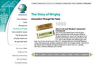 Wrigley - the gum people - has an interesting embedded timeline in their site. The timeline scrolls horozontally (I think it is an iframe) and changes the frame above it. Each year touches on some historical point of interest about the company or their product. Nice. No flash, relatively intuitive and not fussy.
Posted by erin at 09:06 AM | in Timelines :: | Link | Comments (0)
Sunday 09|29|02
Saul Bass
Tribute site for Saul Bass is done in Flash and features Prints -- movie posters and graphic design work, Stills —still clips from movie opening sequences, and Movies — quicktime clips of opening sequences from several Hitchcock movies, Vertigo, Psycho and North by Northwest, several Otto Preminger movies, Anatomy of a Murder, The Man with the Golden Arm and Exodus and several Scorsese movies, Cape Fear and Casino.
Compare the work and style of the sequences between the Hitchcock work and the more recent Cape Fear.
Bass was a genius. “Symbolize and summarize” were the words he lived by according to the author of this site, Brendan Dawes, and that is overtly evident in all his work.
There is also a funky timeline of Bass's work covering the 1950's to the 1990's and a biography of his life and work. He died in 1996.
Posted by erin at 01:21 AM | in History :: Timelines :: Typography :: | Link
Thursday 08|29|02
El Lissitzky
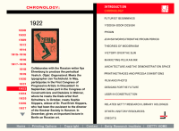 Another flash piece, done by the Getty Museum a few years ago, contains a chronology that showcases the work of El Lissitzky and the highlights of his life. The overall site goes into rich detail about his work and has tons of examples, that popup to larger details. In this particular case, it seems like the site could have been done in HTML just as easily. Nothing that I can see, makes flash a better choice - unlike some of the other museum sites I have commented on in the past.
Technology aside, this is a a great way to get an overview of El Lissitzky and his work and see how it was a product of the times and geography. Lissitzky was a master of communication and information organization. He was skilled across multiple media and his design work feels as fresh and lively today as it was during his life.
Posted by erin at 04:24 PM | in El Lissitzky :: History :: Timelines :: | Link
Monday 07|15|02
Beautiful Complexity
One of the show and tells at the AIGA Summit this past weekend was by Julia Whitney from WGBH in Boston. This project is a companion to the 6 hour miniseries broadcast that ran this year. The interactive, web piece is a fusion of web and flash and video (currently the entire 6 hours of video is online). It is beautifully designed - both in form and in content. The scale of the project is impressive and the piece that stood out most to me is the Time Map that tracks the economic landscape across time and geography. 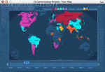
The window and it's settings (say you choose 1950) talk to the other windows as you select to view a report about the country. The time is contextual to your settings in the Time Map and all the information is based on that. They pulled this together for 41 countries across 90 span of time.
This is a rich and interesting site, not only for its content which is interesting, but for the techniques used to create paths and collections of information for people who may want to come at this information in different ways.
Posted by erin at 12:16 AM | in AIGA :: Interaction Design :: Timelines :: | Link
Friday 06|14|02
Another Flash Timeline
I stumbled across the newly redesigned site for RGA - R. Greenburg and Associates. They do a ton of motion graphics (Saturday night Live, the opening sequences for lots of movies, commercials - you've seen their stuff).
I am always on the lookout for elegant and interestingly presented timelines (see the Dr. Leslie timeline). Timelines are an interesting design challenge - there is usually a lot of data, sometimes multiple entries per dated section, sometimes images with text. The nature of time means that there will be scrolling - either horizontally or vertically and often relationships are trying to be made across the time units. The span of the time shown in a timeline also plays a factor in how difficult it is to manage - shorter time spans are always easier than large. This dictates how much can be shown in one screenful and that can make or break the success of the overall cohesiveness of the timeline.
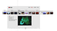 The RGA site has a very beautiful timeline, [click on HISTORY], that gives a nice overview of their work since the creation of the agancy. I found it very easy to use. It gives a nice overview of their work since 1977 without being overwhelming. The timeline is elegant and a beautiful example of what can be done with Flash. There are several layers of information shown at once - the years across the bottom to give a sense of scope, the thumbnails of samples within each year to expand on the depth and as each thumbnail is clicked, specific information about the project, which collected as a whole details the capabilities of the agancy without having to read a boring Capabilities section.
Posted by erin at 10:38 AM | in Sites of Note :: Timelines :: | Link
Tuesday 04|23|02
The Russian Avant Garde Book
The MOMA does it again. A beautiful flash piece explores the depth and breadth of the Russian Avant Garde book.
The site is divided into three major sections:
A Slap in the Face of Public Taste 1910 - 1924
Transform the World 1916 - 1933
Building Socialism 1924 - 1934
There are tons of examples in each section of books shown with mulitple spreads and enlargements. The interface is easy to use and allows for exploration as well as linear reading of the historical information. There are explanations of terms, full bibliographic information about the book with listings of the author and designer.
In the Reading Room section - there are three books offered. Selecting one of them shows stills that you can page through as if you are reading the entire book one page at a time. This is a great idea to show flow of spreads, scale and length of the book. I wish the images were larger though for more detail.
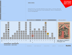 One of the more interesting parts of the site is the Book index. Shown in various forms, the books are arranged on a time line with rollovers of mini covers that show a larger version on the right with it's bibliographic data. The time line has some bold call outs of political events that happened which in turn affected the work of the book authors and designers. In addition there is a pulldown with a complete list of all the book authors and another that lists all the publishers. Too bad there isn't one listing all the designer/artists as well since not all the authors were designers. This is a very innovative way to show a large matrix of information in a small amount of space. It is very beautiful, useful and usable.
This is a design history goldmine.
Posted by erin at 08:38 AM | in History :: Timelines :: | Link


