design::writings
Jan Tschichold
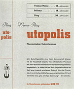
 Dean Allen of Textism writes about Jan Tschichold and his tenure at Penguin Books. Actually, the post is mostly about Penguin Books, but he spends some time discussing Tschichold's transformation of Penguin Books and how his standards guidelines set the tone for the printing of their books for decades.
Allen's post reminds me that Tschichold is one of those designers from the Bauhaus era who is not heard about much in design history. We learn about him and his contributions - predominantly around typography - but he isn't brought up over and over again like the Herbert Bayer's or other more well known designer's of the day. I have often wondered why - his work was intense and quite elegant, even when he cast off the modernist, international style and changed his way of thinking. Perhaps it is because many other designers had a longer time in the spotlight or a larger body of work? Maybe it's an American thing.
Information about Tschichold is not abundant on the web and much of it is from font houses because of the fact that Tschichold designed the face Sabon.
Here are a few of the better sites:
Frostdigital
Linotype: Font Store
Inventory of the Jan and Edith Tschichold Papers | 1899-1979 | Getty Research Institute
Related Books:
The New Typography: A Handbook for Modern Designers by Jan Tschichold. This book is a classic if you are interested in studying about the modernist international style of typography as practiced by the Bauhaus designers.
Jan Tschichold: A Life in Typography by Ruari McLean. About the designer and his work and cultural influences.
Posted by erin at 09:57 PM | in History :: | Link
Wednesday 01|29|03
Powers of Ten revisited
I love the Powers of Ten movie by Ray and Charles Eames. I have talked about it several times here in designwritings and on boxes and arrows. boingboing points me to Science, Optics and You which houses an interactive java applet that takes the concept of the Powers of Ten, revisits the idea with current science and optical equipment (think landsat images over the earth and super magnified microscopes) and presents a very cool experience.
While this applet is very cool, it is missing the presentation of information that made the Powers of Ten an information design masterpiece. The website has paragraphs of text to explain the concepts that the Eames displayed with very elegant information design accompanying the images.
Posted by erin at 10:57 PM | in Theory :: | Link | Comments (0)
Friday 01|24|03
Nice Chart

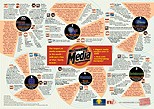
Not only informative, this chart is also really interesting to look at and is a nice example of complex information design. There's also background on the research that went into the making the chart.
Posted by erin at 09:03 AM | in Information Architecture :: | Link | Comments (3)
Tuesday 01|21|03
Golden Mean
An interesting article discussing the Golden Mean and its appearance in art, science and nature.
Posted by erin at 01:25 PM | in Theory :: | Link | Comments (1)
Saturday 01|18|03
IA Summit Preconference
Don't forget the preconference offerings the day before the summit officially begins.
AIfIA is offering a full day workshop: �Information Architecture Leadership Seminar with presentations and topics presented by Peter Morville, Victor Lombardi, Rashmi Sinha and Louis Rosenfeld and Karen McGrane. I'll be there as a facilitator or something. This is gonna be great!
Full details can be had here.
Posted by erin at 01:09 PM | in Information Architecture :: | Link
IA Summit
The details for the ASIST IA Summit are available and boy does it look great. Lots of really interesting talks and presentations. The keynote is Stewart Brand. It was loads of fun last year and I am sure will prove to be equally as entertaining this year. Takes place in Portland which should be fun - I haven't been there before.
I am most interested in these talks - A Spirit of Simplicity": What Information Architectures Can Learn form the Arts and Crafts Movement and Hypertext Gardens which will look at architecture in the arts and crafts movement and the bauhaus and where IA maps or shouldn't map to earlier concepts. I am always intrigued by looking at what we can learn from the past.
Posted by erin at 01:07 PM | in Information Architecture :: | Link
Sunday 01| 5|03
Swiss Posters
Check out the wonderful collection of swiss posters that have been collected in the Carnegie Mellon Special Collections. Sponsered by the School of Design at CMU, this website presents the posters in a nice pre-categorized way. The information section of the site is quite interesting: giving a bit of history about Swiss posters - the Swiss School legacy and then background about the collection.
Organized by the following categories: Type Dominant, Hand Lettering, Illustration, B/W Photography, Color Photography, Concerts, Exhibits, Theater/Film. Sports, Fashion, Food and Drink, Consumer Products, Tourism/Travel, Politics and Safety - the collection can easily be browsed. Each poster is presented with the known data - date, title, client, ad agency, designer and printer. Within each category you can move forward and back and see a larger version of the poster in a pop up window (although the icon for this - a square - led me to think that it would take me back to the main menu rather than popping up an enlargement).
In addition to the browse (Tour) mode, you can search as well by a variety of criteria.
The collection focuses on posters from the 1970's forward.
Posted by erin at 10:58 PM | in History :: | Link


