design::writings
Collective Typography
The folks over at Typophile have a project going that taps into the collective visualization ideas of it's visitors. They are building letters of the alphabet pixel by pixel, based on the whims of the visitor. Each visitor is asked to designate the color (black or white - letter or background) of a pixel that makes up the letter. Very interesting. The viewer can also view an animation of all the choices made for that letter to day - watch as the letter comes together and morphs from a serif font to a sans serif font and back again. Pretty cool to playaround with.
Posted by erin at 04:13 PM | in Typography :: | Link
Saul Bass
Tribute site for Saul Bass is done in Flash and features Prints -- movie posters and graphic design work, Stills —still clips from movie opening sequences, and Movies — quicktime clips of opening sequences from several Hitchcock movies, Vertigo, Psycho and North by Northwest, several Otto Preminger movies, Anatomy of a Murder, The Man with the Golden Arm and Exodus and several Scorsese movies, Cape Fear and Casino.
Compare the work and style of the sequences between the Hitchcock work and the more recent Cape Fear.
Bass was a genius. “Symbolize and summarize” were the words he lived by according to the author of this site, Brendan Dawes, and that is overtly evident in all his work.
There is also a funky timeline of Bass's work covering the 1950's to the 1990's and a biography of his life and work. He died in 1996.
Posted by erin at 01:21 AM | in History :: Timelines :: Typography :: | Link
Saturday 09|28|02
jon coltz interviews jessica helfand
jon coltz interviews Jessica Helfand about her design thoughts, process and typography decisions for the book Econometrics, by Fumio Hayashi. He also speaks with her about her own book Reinventing the Wheel.
The rest of his site is pretty interesting to read as well.
Posted by erin at 06:51 PM | in Graphic Design :: | Link | Comments (0)
Man of the Streets
Nice one page collection of work by A. M. Cassandre. Cassandre was a master poster designer in the 20s and 30s. Perhaps his most iconic works are the travel posters and the Dubonnet man. I have two of his posters - reprints from the MOMA - hanging in my house. This man was a genius at composition, scale and typography.
Posted by erin at 06:42 PM | in Graphic Design :: | Link
Monday 09|23|02
Super Experience
My sister has launched her website. Some sections are still in progress, but it promises to be pretty cool and a unique experience. The site showcases her photography, video and installation work. Check it out and offer her a job.
Posted by erin at 08:38 PM | in Sites of Note :: | Link | Comments (0)
Thursday 09|12|02
Gain is back
Gain the online design journal is back - more focused on the intersection between business and design. Some interesting articles on brand and value. Also interesting is how they actually implemented the site - the main navigation pops out to expose a scroll bar when needed. Kind of neat. Getting back to home though is another matter - the page stalls (on a mac) and then crashes the application - not the best user experience.
Posted by erin at 10:18 PM | in Magazines :: | Link
Sunday 09| 8|02
Poster Genius
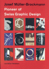
 Josef Muller-Brockmann was one of the modernist greats. His poster designs are the epitome of Swiss graphic design and his use of the grid system shows that structure can be flexible. I studied the work of Brockmann in graduate school. This site features a nice gallery of his work and a brief bio. I highly recommend this book if you are interested in more on his work.
Posted by erin at 09:31 PM | in Graphic Design :: History :: | Link | Comments (2)
Saturday 09| 7|02
Saturday Fun
My father sent this link to me and I can honestly say I have never had so much fun pounding on the keyboard as I did experimenting with this site.
With all the emphasis on usability and brand and ROI, we sometimes forget that delight and fun can be a pretty profound goal as well.
Enjoy!
Posted by erin at 05:18 PM | in Interaction Design :: | Link | Comments (1)
Thursday 09| 5|02
Communication Arts Interactive Design Winners
CA has posted the winners of the Eighth Annual Interactive Design Annual.
There are blurbs from each of the jurors and each winner has its own page with an overview about the project, contributor's credits and creator's comments. There are a lot of folks here in several different categories and there are video clips of commentary from each of the jurors as well. This is going to take a while to get through.
I like the fact that they offer two links to the projects as well. One to the live site and one to a cached version. Which seems nice considering how fast and how often sites change.
Posted by erin at 03:38 PM | in Interaction Design :: Magazines :: | Link


