design::writings
Using Flowmaps
I went ahead and added a brief blurb and link to my ASIST IA Summit presentation to the Artifacts page here on my site.
Feel free to send questions about the preso or about how my team uses these giant flowmaps.
Posted by erin at 11:16 PM | in Conferences :: Information Architecture :: | Link
Information Design: What Is It?
There is a really interesting set of articles about Information Design collected together over at the AIGA forums.
There are pieces by Terry Irwin (MetaDesign), Erik Speikermann (MetaDesign) and Nigel Holmes (a great info designer). Each article touches on a different facet of the field and the collection is set up for discussions by readers.
Posted by erin at 10:22 AM | in AIGA :: Information Architecture :: | Link
New BandA Issue
New issue of Boxes and Arrows is up. This week - an article by Nathan Shedroff about designing for people rather than computers and a review of the Hillman Curtiss book "Making the Invisible Visible: Process, Inspiration and Practice for the New Media Designer".
Posted by erin at 09:08 AM | in Information Architecture :: Magazines :: | Link
Friday 06|21|02
Type on a different level
This has got to be one of the most interesting and novel typgraphic experiences I have seen in a long time. Type as central character, set, actors, and location all rolled into one. You get sucked into the story and forget it is all type. Very cool!
Posted by erin at 11:29 AM | in Typography :: | Link
Thursday 06|20|02
July 1942: United We Stand
 The Smithsonian Institute has put together a terrific site that looks into depth at the United We Stand, July 1942 campaign that encouraged magazines from all over the nation to print a patriotic, theme related cover. The site has a full database of over 300 magazine covers divided up by different patriotic themes: The War Effort, What We Are Fighting For, Reaching Many Audiences and Designing the Covers. This site is visually rich and very topical considering we are coming up on the first July 4th following 9-11.
Posted by erin at 01:56 PM | in History :: Magazines :: | Link | Comments (0)
Tuesday 06|18|02
New Article
I have a new article up over at Boxes and Arrows. It's about Vannevar Bush and the article he wrote on "the memex" in 1945 for The Atlantic Monthly.
Posted by erin at 10:50 PM | in History :: Magazines :: | Link
New Issue of Loop
The new issue of Loop is out. The issue looks at several different academic programs and their curricula, with articles from Marc Rettig (IIT), Ron Saito (California State U), Brenda Laurel (Art Center) and others.
In a moment of synchronicity, the journal also offers an article by Steven Heller about Ladislav Sutnar and his approach to information design, navigation and other tools that are so relevant to today's web designer. I say this is synchronicity - for me - because I had just started researching the work of Sutnar this weekend for a future article for the Forerunners section of Boxes and Arrows along the same premise. I also was in an email conversation today about his work with an aquaintance discussing this very same thing.
So, Heller beat me to the punch. Go, read and be inspired.
Posted by erin at 03:12 PM | in AIGA :: Magazines :: | Link
Sunday 06|16|02
Typography book reviews and more
A collection of interesting book reviews about typography, design and type related books is over at Typotheque.com. There are reviews by Steven Heller, Andrew Blauvelt among others.
The reviews section is only one of three worth perusing. Interviews and Essays also are full of interesting and rich information by such authors as Steven Heller, Jessica Helfand, Robin Kinross and others. One of the most interesting interviews is Steven Heller interviewing Don Norman - the interview was done shortly after the 2000 election and a lot of the conversation revolves around the butterfly ballot. But it is interesting nonetheless to see these two (Heller and Norman) viewpoints about design.
Typotheque is a type foundry and site run by Peter Bilak based in The Hague, the Netherlands.
Posted by erin at 01:29 PM | in Sites of Note :: Typography :: | Link | Comments (0)
Friday 06|14|02
Another Flash Timeline
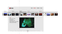
I stumbled across the newly redesigned site for RGA - R. Greenburg and Associates. They do a ton of motion graphics (Saturday night Live, the opening sequences for lots of movies, commercials - you've seen their stuff).
I am always on the lookout for elegant and interestingly presented timelines (see the Dr. Leslie timeline). Timelines are an interesting design challenge - there is usually a lot of data, sometimes multiple entries per dated section, sometimes images with text. The nature of time means that there will be scrolling - either horizontally or vertically and often relationships are trying to be made across the time units. The span of the time shown in a timeline also plays a factor in how difficult it is to manage - shorter time spans are always easier than large. This dictates how much can be shown in one screenful and that can make or break the success of the overall cohesiveness of the timeline.
 The RGA site has a very beautiful timeline, [click on HISTORY], that gives a nice overview of their work since the creation of the agancy. I found it very easy to use. It gives a nice overview of their work since 1977 without being overwhelming. The timeline is elegant and a beautiful example of what can be done with Flash. There are several layers of information shown at once - the years across the bottom to give a sense of scope, the thumbnails of samples within each year to expand on the depth and as each thumbnail is clicked, specific information about the project, which collected as a whole details the capabilities of the agancy without having to read a boring Capabilities section.
Posted by erin at 10:38 AM | in Sites of Note :: Timelines :: | Link
Saturday 06| 8|02
Noted Illustrator

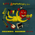
Recently found this site, about illustrator Jim Flora. He illustrated many album covers for Columbia and RCA. The site provides images of many of these covers as well as samples of some of his magazine work, a couple of interviews and a variety of other items testifying to the talent of this interesting illustrator.
Dr. Robert L. Leslie - of the AD gallery and PM and AD Magazine said this of Flora in the exhibition keepsake for the exhibition of Flora's work - "Flora succeeds in making you laugh, as every good cartoonist should. [But] while you're busy laughing, he's planning to murder you."
Posted by erin at 07:43 PM | in History :: Sites of Note :: | Link | Comments (1)


