design::writings
Friday 01|24|03
Nice Chart

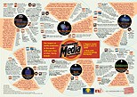
Not only informative, this chart is also really interesting to look at and is a nice example of complex information design. There's also background on the research that went into the making the chart.
Robot Wisdom pointed to this article recently: http://www.adbusters.org/magazine/45/articles/brand_america_project.html which seems like a nice complement to the one you link to... or at least mildy related.
Posted by Bryce at January 28, 2003 09:18 PM...................................................
I don't think the linked chart is a good example of information design. It's pretty, and attractive, I suppose, but it could convey a similar amount of information using less obnoxious techniques. I spent a significant amount of time trying to understand what each pie represented; and trying to decipher their values, only to realize I was looking for the wrong thing. There is lots of multivariate information here, but if it is to be presented in the "pie-chart metaphor," it ought to be backed up by numerical data.
Posted by Jacob Walker at January 29, 2003 11:23 PM...................................................
i suppose you are right - it isn't actually that great in terms of presenting info in a pie-chart metaphor. i don't think that's what they were trying to do - but that may be just me - i certainly didn't read it that way. I actually read the circular forms to be film or reel-to-reel tapes since this chart is about media and music groups.
I thought it was an interesting presentation to a large amount of information. It caught my eye and drew me in to read it and that would be (i assume)part of the goal of this piece.
Posted by erin at January 29, 2003 11:50 PM...................................................
...................................................


